

Panda & Co.
A Perth cafe brand, founder-built. Ten years live, still running the original grammar.
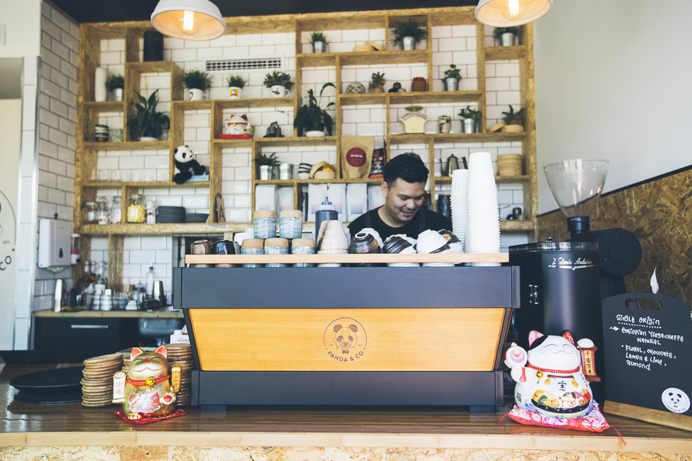
The cafe is run by the people who built the brand.
Panda & Co opened in Perth's CBD in 2015. The kitchen is run by Andy and Rebecca, lifelong friends from Perth and Borneo. Andy comes from a multi-generational Cantonese restaurant family, with a separate background in cocktail bartending. Rebecca brings classic Malaysian flavour and runs the coffee. The pair tested the concept as pop-up kitchens before the bricks-and-mortar.
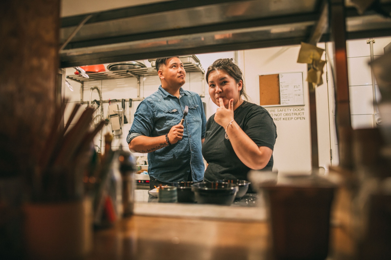
Andy Ngo and Rebecca Yii, co-founders.
This is the longest-running OTW build. It is also the only one where the founder and the studio share the same person.
Self-briefed. Self-tested. Still running.
Open a cafe that reads as confident, distinctly Perth, and unmistakably its own. Not generic Asian. Not nostalgic Asian. Asian fusion that owned the inauthenticity rather than apologising for it. The brand had to do that work before anyone walked through the door.
Three things had to be true. The mark had to be specific enough to stick. The voice had to be honest enough that staff could speak it naturally. And the operating surfaces all had to read as the same business, run by people who care.
Voice before logo.
Voice first. "Proudly inauthentic Asian, with a sprinkling of modern Australian and a fistful of flare." That sentence ran the brand. It set the menu copy, the staff scripts, the captions. A brand without a line drifts. A brand with a line the founders actually use stays consistent for ten years.
Identity behind the food. A typographic mark, restrained, that does not compete with the plate. The visual register sits behind the food, which is the point. The menu carries the personality. The brand carries the calm.
Operating surfaces as one set. Web, menu, signage, social. Same type, same restraint, same humour. When the founder runs the operation, the brand has to be runnable without a brand guardian. So we built it to be operated, not policed.
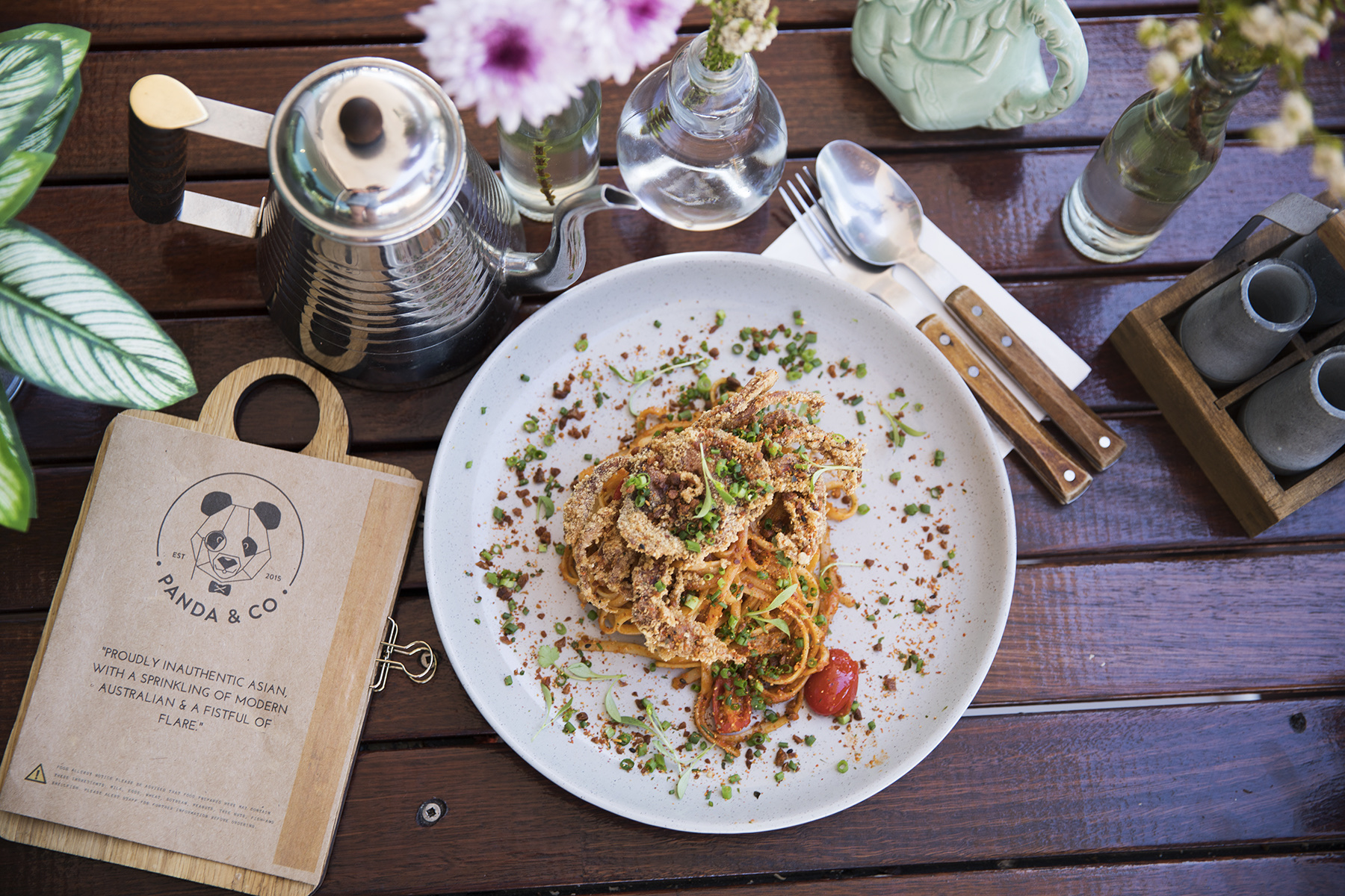
The line that ran the brand.
Every surface, one set.
Identity, website, menus, signage, social. Built in one move so the cafe could operate without a brand guardian. The founders run the brand because they wrote it.
- iIdentity. Wordmark, mark, type stack, palette. Designed for both food photography and small-format print.
- iiWebsite on Squarespace. Deliberately. So Andy and Rebecca can update menus, hours, and bookings themselves. Reservations and online cart wired in.
- iiiPrint menus designed to rotate. Seasonal updates land as copy changes, not redesigns. Autumn 2024 is the current set.
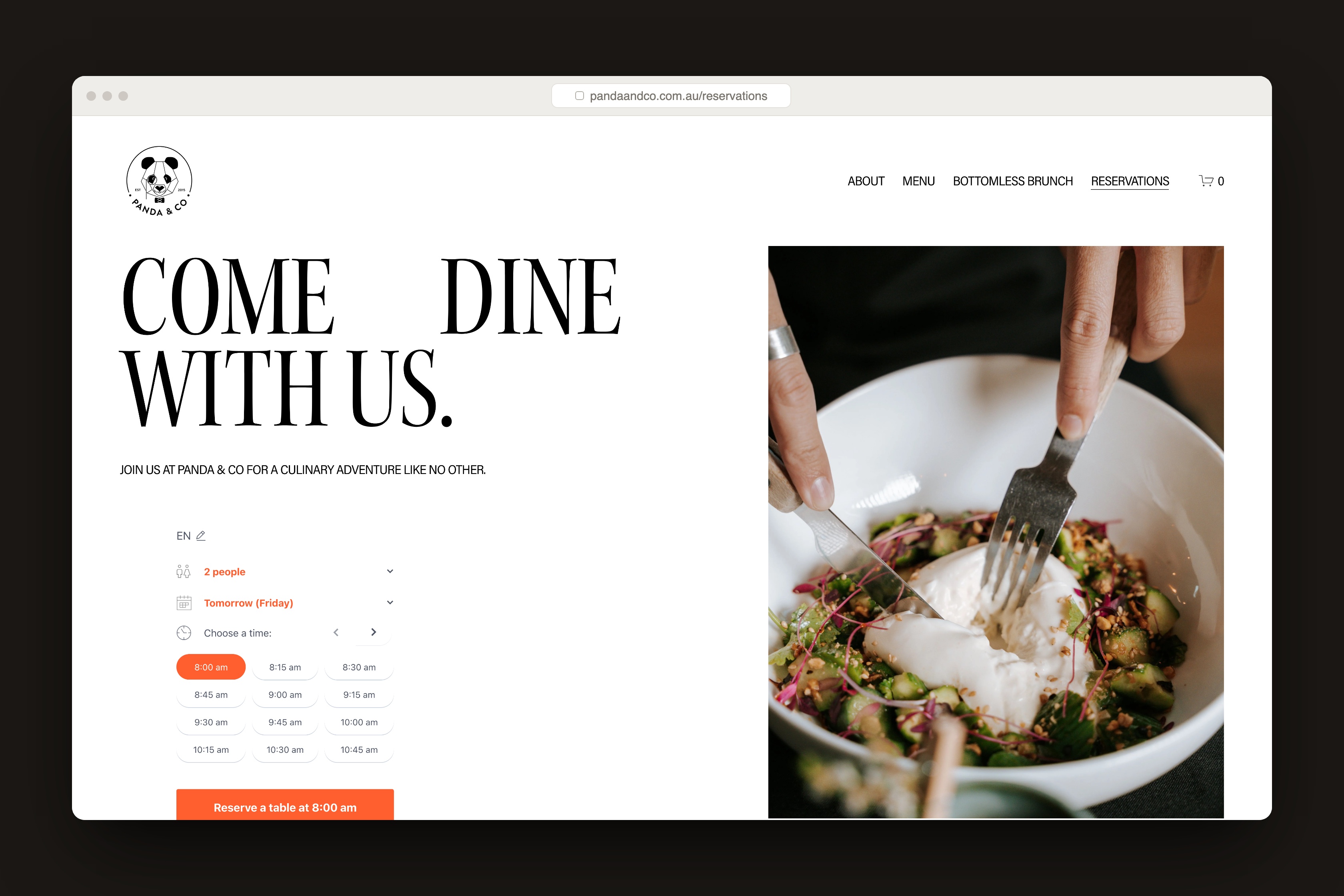
The Squarespace surface. Operated by the founders since launch.
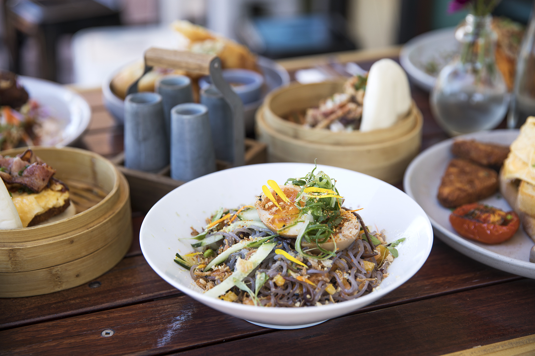
Print menu, Autumn 2024. Same grammar as 2015.
The wordmark, on the sign that's been there ten years.
Ten years live. Still running the original grammar.
The cafe sits at the same address, with the same wordmark, the same voice, the same operating logic. Menus rotate by season. The web surface has been updated for reservations and online ordering as platforms evolved, but the bones haven't moved.
That is the result OTW pitches to other clients now. A brand that you can still run ten years later, without a refresh cycle. A site you can operate yourself. A voice your staff can actually use.
The brand worked because the founders wrote it.
The honest version of this case study is the only version worth running. Andy built Panda & Co's brand because Andy was opening Panda & Co. The brand has not changed since because it works for the business it was built for. That is the entire test.
Most case studies want to tell you about the launch. This one is about everything after. The brand still runs because the founders still run it. The studio that built it has spent the decade since taking what it learned in this cafe and applying it to other businesses.
The cafe was the first OTW project. It is also the proof.
I ran a brand before I built brands. That's the only reason I know what to leave in, and what to leave out.
See the rest of the work.
Got a project like this?
Tell us what you're building. A short call, no obligation — if we're not the right fit, we'll point you to someone who is.